
Section catalog
Every section type in one place: what each one is for, when another type fits better, and which pages offer it. The groups match the “Select section type” dialog in the panel.
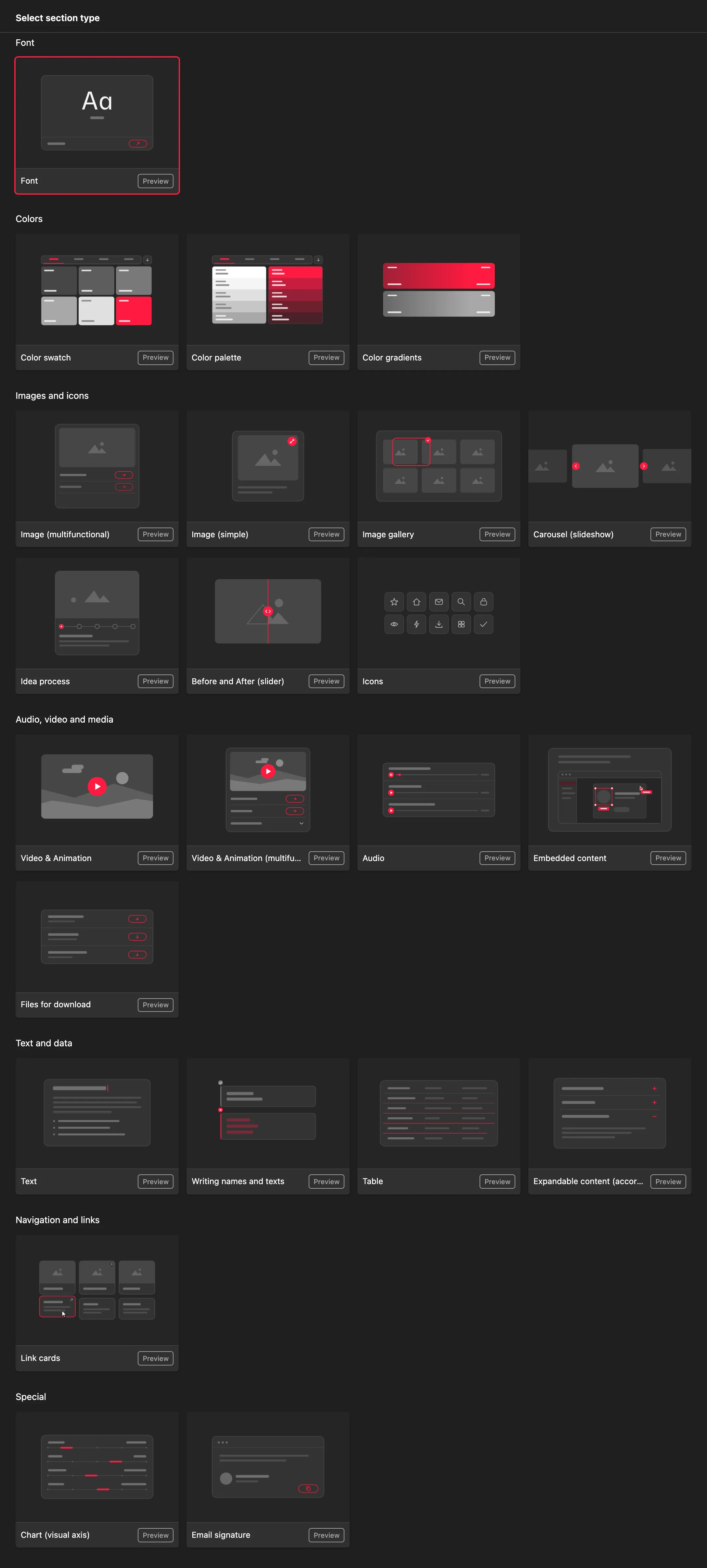
Features all sections share
Every section has a name, shown on the site as its heading. Most sections have Description in the left column and an Info box (highlighted text) on the left, set to Note, Tip or Warning.
Many sections can show buttons below the content (an external link, a manual page or a file to download) and expandable content. A link or file in a button can be protected with a password or a company email domain – see Lock downloadable files.
Adding, moving and hiding a section is covered in Working with sections.
Text and data
| Section | What it is for | When to use another |
|---|---|---|
| Text | Explanations and rules – brand purpose, tone of voice, procedures. Supports heading and subheading, bold, bulleted, numbered and task lists, links and code. | A long list of questions or rules – Expandable content (accordion). Correct and incorrect forms of a name – Writing names and texts. |
| Expandable content (accordion) | Titled items that expand on click – FAQs, detailed rules. Optionally with an image above the items and buttons below. | Short text that should be visible straight away – Text. |
| Writing names and texts | Correct ✅ and incorrect ❌ forms side by side. Writing names mode (in color, no formatting) or Writing texts mode (with formatting). | A general explanation without a comparison – Text. |
| Table | Data in rows and columns – print formats, dimensions, codes. Default, Horizontal lines, Vertical lines or Grid style; text, buttons and expandable content can go below the table. | Color values – Color swatch. Running text – Text. |
For details, see Text, headings and expandable content.
Images and icons
| Section | What it is for | When to use another |
|---|---|---|
| Image (simple) | One or more stacked images, each with optional text. Includes the Show large preview on click option. | An image with download buttons – Image (multifunctional). A row of examples – Image gallery. |
| Image (multifunctional) | An image with buttons (link, page, file) and expandable content below it. Several selected images are shown as a slideshow. | A plain image without buttons – Image (simple). |
| Image with hotspots (interactive) | Numbered points right on the image – a mockup, a business card, a vehicle wrap. The point text appears as a tooltip or in a list below the image. Not available on Typography pages. | A caption below the image is enough – Image (simple). |
| Image gallery | A row of examples with captions. Each image can be marked ✅ Allowed or ❌ Forbidden – useful for correct and incorrect logo use. You can limit how many images are shown; the rest load with a “Load more” button. | Photos that visitors inspect up close in fullscreen – Large gallery. |
| Large gallery | An image bank – higher-resolution photos with small or large previews. Only on a Large gallery page. | A few illustrations on a content page – Image gallery. |
| Carousel (slideshow) | Slides one after another with a Slide or Crossfade transition – for example, a series of campaign visuals. | All images should be visible at once – Image gallery. |
| Idea process | Two to five numbered steps, each with an image and description – for example, how the logo came about. | Comparing only two states – Before and After (slider). |
| Before and After (slider) | Pairs of images that visitors compare with a slider – for example, old and new visuals. | More than two states – Idea process or Image gallery. |
| Icons | SVG icons in a grid, all together or in groups. Visitors can recolor them and download them as SVG, PNG, WebP or PDF at 16 to 1024 px, or all at once as a ZIP. | A single decorative illustration – Image (simple). |
For details, see Images and galleries.
Audio, video and media
| Section | What it is for | When to use another |
|---|---|---|
| Video & Animation | One or more videos and animations: YouTube, your own video file or a Lottie animation. Small or large previews, text below the video. | A video with a download button for the source – Video & Animation (multifunctional). Vimeo or Loom – Embedded content. |
| Video & Animation (multifunctional) | A single video or animation with buttons and expandable content below it. | Several videos side by side – Video & Animation. |
| Audio | A sonic logo, jingle or voice sample (MP3, WAV). Each track has an Allow download option. Not available on Colors pages. | Video with sound – Video & Animation. |
| Embedded content | Live content from another service, embedded by link: Figma, Canva, Miro, Google Docs, Sheets and Slides, Loom, Pitch, PDF, YouTube, Vimeo and more. | A file people should download – Files for download. Your own HTML tool – a Custom online tool page. |
| Files for download | A list of files, each with a description, name, size and download button. Each file can be protected with a password or an email domain. | One file next to an image or video – a download button in that section. |
For details, see Video, audio and animation, Downloads and Embeds and custom tools.
Navigation and links
| Section | What it is for | When to use another |
|---|---|---|
| Link cards | Cards linking to other pages of the manual or to any address. Text cards or Image cards in one section. Select several pages at once to create a card for each. | A single link – a button in another section or a link in Text. |
| Text cards (portal) | Text cards for selected pages plus cards with external links. The main section of a Portal page. | On a content page, Link cards cover both text and image cards. |
| Image Cards (portal) | Cards with an image and title that link to a page or URL. For Portal pages. | On a content page, Link cards set to Image cards. |
Cards on the home page are covered in Home page cards.
Colors and fonts
| Section | What it is for | When to use another |
|---|---|---|
| Color swatch | Brand colors with HEX, CMYK, Pantone C and U, RAL, NCS and 3M values. Small, Medium or Large size; visitors can download the palette. | Shades of one color together – Color palette. |
| Color palette | Groups of colors (for example, shades of blue) in one strip. Compact or Wide size. | Main colors with full print values – Color swatch. |
| Color gradients | Gradients of two or three colors. | Individual colors – Color swatch. |
| Contrast checker | An interactive tool: visitors pick a text and background color and see the AA and AAA rating. Colors pages only. | A fixed list of allowed combinations – Image gallery with ✅ and ❌. |
| Color ratios | The proportions in which colors are used – one universal ratio or separate ratios for light and dark mode. Colors pages only. | A list of colors without proportions – Color swatch. |
| Font | A font specimen: glyphs, font information, a tester, the styles in use and buttons for download (ZIP), a link or email. One section per font family, Typography pages only. | Typesetting rules described in words – Text. |
Special
| Section | What it is for | When to use another |
|---|---|---|
| Chart (visual axis) | Axes between two opposites (for example, traditional – modern) with a dot showing where the brand stands. Useful for describing brand personality and tone. Not available on Colors pages. | Numeric data – Table. |
| Email signature | The signature’s HTML code with marked editable fields. Visitors fill in their name and contact details and copy the signature. Not available on Colors pages. | A more complex generator (business cards, banners) – a Custom online tool page. |
The email signature and custom tools are compared in Embeds and custom tools.
Which page type offers which sections
| Page type | Sections offered |
|---|---|
| Content page | Every general section, including the portal cards. Not offered: Font, Contrast checker, Color ratios, Large gallery. |
| Logo | Same as a content page, but without the portal cards. |
| Typography | Font plus the general sections, except Image with hotspots and the portal cards. |
| Colors | All color sections, including Contrast checker and Color ratios, plus most general ones. Not offered: Writing names and texts, Audio, Chart, Email signature, portal cards. |
| Large gallery | Only Large gallery. |
| Download center | Files for download and Link cards. |
| Writing rules | Only Writing names and texts. |
| Portal | Text cards (portal) and Image Cards (portal). |
Each page type is described in detail in Page types.
Older section types
Older manuals may contain the Archetype, Main color swatch, Small color swatch and Google Drive sections. They still appear on the site and you can edit them in the panel, but you can no longer add new ones. Instead of the old swatches, use Color swatch (available in Small, Medium and Large); instead of Google Drive, use Embedded content.