
Manual design
On the Design page you set how the manual website looks: colors, fonts, corner radius, the home page background, the header logo and the favicon. Saved changes apply across the whole site.
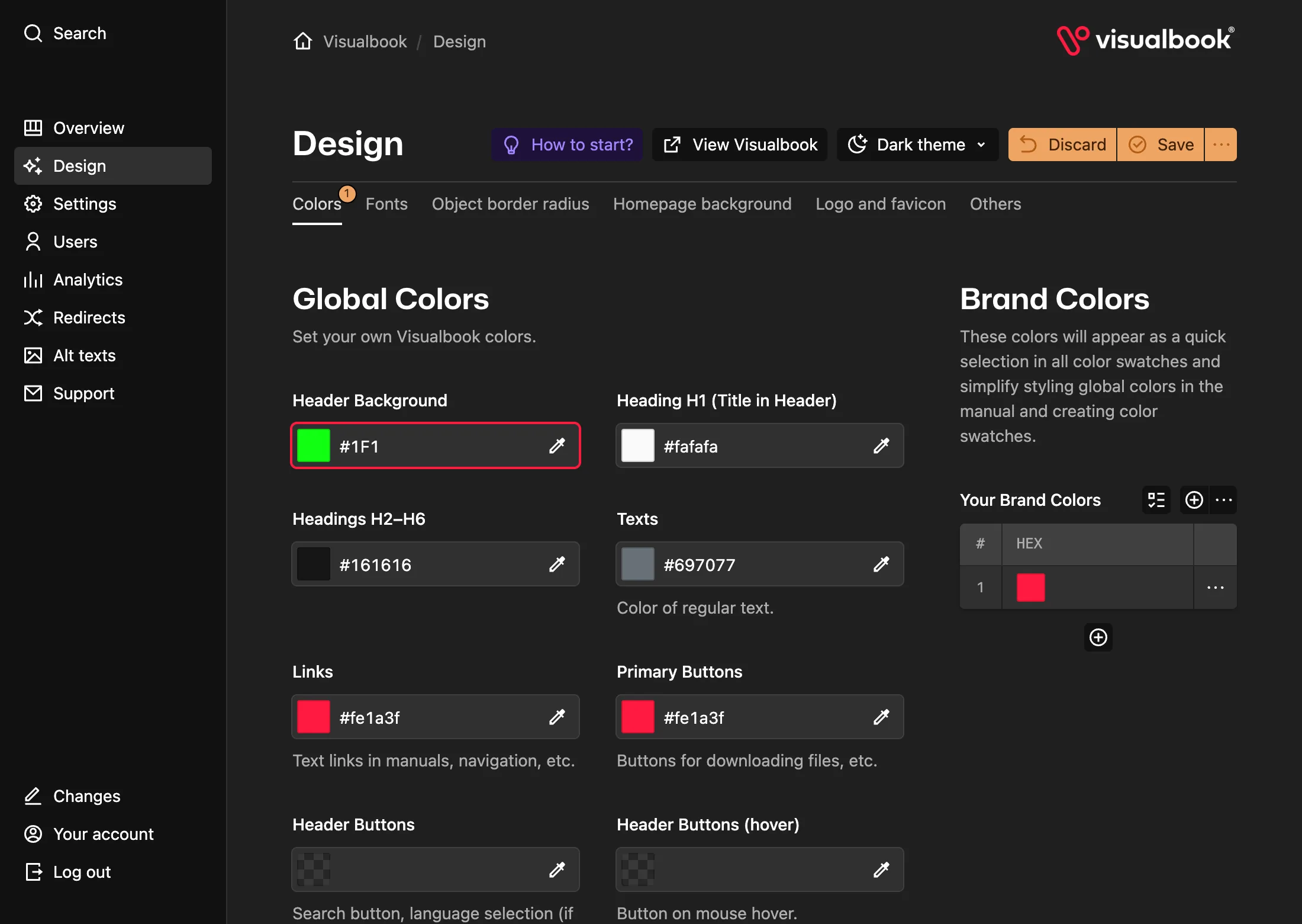
What you will have
A manual in your brand’s colors and fonts, with your logo in the header and your own favicon.
Steps
Open Design
In the panel’s left menu, click Design. The page has the tabs Colors, Fonts, Object border radius, Homepage background, Logo and favicon and Others.
Enter your brand colors
On the Colors tab, add your brand colors under Your Brand Colors on the right – the HEX value (for example
#E30613) and a Color Name (for example “Red”). These colors then appear as quick picks in every color field in the panel.Set the global colors
On the left, choose colors for these elements:
- Header Background
- Heading H1 (Title in Header)
- Headings H2–H6
- Texts
- Links
- Primary Buttons
- Header Buttons
Website Background can be white (
#ffffff) or very light gray (#fafafa). An empty field means the default color.Choose the fonts
On the Fonts tab, upload fonts to Select font for headings, Select font for texts (Regular) and (Bold). TTF, OTF, WOFF and WOFF2 are accepted; WOFF2 is recommended because it loads fastest. Using Adobe Fonts? Paste your web project’s Adobe Fonts: Project ID – after saving, its fonts appear in the font pickers.
Add the logo and favicon
On the Logo and favicon tab, upload an SVG logo to Logo in header and set its width with the Logo size in header slider (50–250 px, default 180 px). Upload a square JPG, PNG or WebP image to Favicon. Visualbook resizes it to 192 px and saves it as PNG on upload.
Save and check the site
Click Save, then View Visualbook – the manual’s home page opens with the new look.
How to tell it worked
The header shows your color and logo, headings use your chosen font and the browser tab shows your favicon.
What each tab controls
| Tab | What it controls | Ranges and options |
|---|---|---|
| Colors | Global colors, Large Card Colors (Text Section), UI Element Colors (tooltip, info box, badges, Allowed, Forbidden), brand colors | Line Between Image and Text on large cards (useful for very light cards) |
| Fonts | Heading and text fonts, Adobe Fonts | Heading Size 0.8–1.1; Text Size 14–18 px (default 16); Line Height (texts) 1.0–2.0 (default 1.5); letterspacing −0.1 to 0.1 |
| Object border radius | Corners of buttons, cards, badges and tooltips | Buttons and Header Buttons 0–50 px (default 8); Cards, Badges, Tooltips 0–16 px (default 16) |
| Homepage background | Image behind the home page header | JPG, PNG, WebP or SVG; Image Alignment; Image Properties: Cover, Contain, Repeat |
| Logo and favicon | Header logo and the browser tab icon | SVG logo, width 50–250 px; favicon from JPG, PNG or WebP |
| Others | The strikethrough line in the logo’s “Things to avoid” sections and in galleries | Line Weight: Normal, Strong, Heavy |
Typography options
Typography Settings for Headings offers all caps and the OpenType features your uploaded font contains. Typography Settings for Texts offers tabular numbers and the font’s text features. When you swap the font, options the new font doesn’t support are removed automatically.
Home page background
- Turning on “Show also on all subpages” under Show background image extends the background to the header of every page.
- Show image on mobile devices? defaults to No. Disable background at width then sets the screen width below which the background is hidden (default 768 px).
- With Repeat, you set the Repeated Image Width in Pixels.
Who edits Design, and other notes
- If the header logo or favicon is missing, the Tips to improve your Visualbook box on the Overview tells you.
- Design is edited by the Admin role. The Multibrand editor doesn’t have Design in the menu.
- In Multibrand mode each subbrand can have its own colors, fonts, background and logo – see Multiple brands in one manual.
- The designer or studio name and link in the footer are set by Visualbook support. See Support and contact to get in touch.