
Images and galleries
Which image section to choose, what happens to an image after upload and how to add alternative text. Also includes a walkthrough for an image with interactive hotspots.
Which image section to choose
| You need | Section | Extras |
|---|---|---|
| one image with text below | Image (simple) | several stacked images, enlarge on click |
| an image with a download button | Image (multifunctional) | buttons, expandable content, several images as a slideshow |
| do and don’t examples | Image gallery | ✅ Allowed / ❌ Forbidden marks, captions, “Load more” |
| a photo bank | Large gallery | higher resolution, small or large previews; only on a Large gallery page |
| slides one after another | Carousel (slideshow) | Slide or Crossfade transition, arrow and indicator colors |
| labels placed right on the image | Image with hotspots (interactive) | points you drag with the mouse, labels as a tooltip or list |
| compare two states | Before and After (slider) | slider, Before and After captions |
| show how the logo evolved, step by step | Idea process | 2 to 5 numbered steps |
| an icon set to download | Icons | recoloring, SVG/PNG/WebP/PDF, ZIP |
Most image sections have an Aspect ratio of images option: Original, 16:9, 4:3 or 1:1. A fixed ratio aligns photos of different sizes in a uniform grid.
What happens to an image after upload
Image sections accept JPG, PNG, WebP, GIF and SVG. Visualbook scales a photo uploaded to a section down for the web and saves it as WebP – 1460 px wide in most sections, up to 1920 px in galleries. Pages load quickly and storage space is saved.
Do and don’t examples in a gallery
In an Image gallery, every image has a Usage of the image option: Bez pravidel (no rule), ✅ Povoleno (allowed) or ❌ Zakázáno (forbidden) – these options are labeled in Czech even in the English panel. A forbidden image is struck through and an allowed one gets an icon. Set their colors in ❌ Strike-through color and ✅ Icon color.
A typical example: six logo variants on different backgrounds, three allowed and three forbidden. Number of photos displayed at once limits how many images are visible; the rest load with the “Load more” button.
Creating an image with interactive hotspots
- Add an Image with hotspots (interactive) section and upload an image into Image – a business card mockup, for example.
- In Hotspots on the image, click the image – a numbered point appears where you clicked. Drag points with the mouse to move them.
- Write a Hotspot text for each point, for example “Inter Bold, 9 pt”.
- In Hotspot label display, choose Tooltip texts (the text appears when the point is clicked) or Texts below the image (a numbered list under the image).
- On the Appearance tab, set the dot color, the tooltip colors and font size, and the dot pulsing effect.
Alternative text
Every image has an Alternative text (alt) field – a short description for screen readers and search engines, such as “Firma logo on a dark blue background”. Leave it empty for purely decorative images.
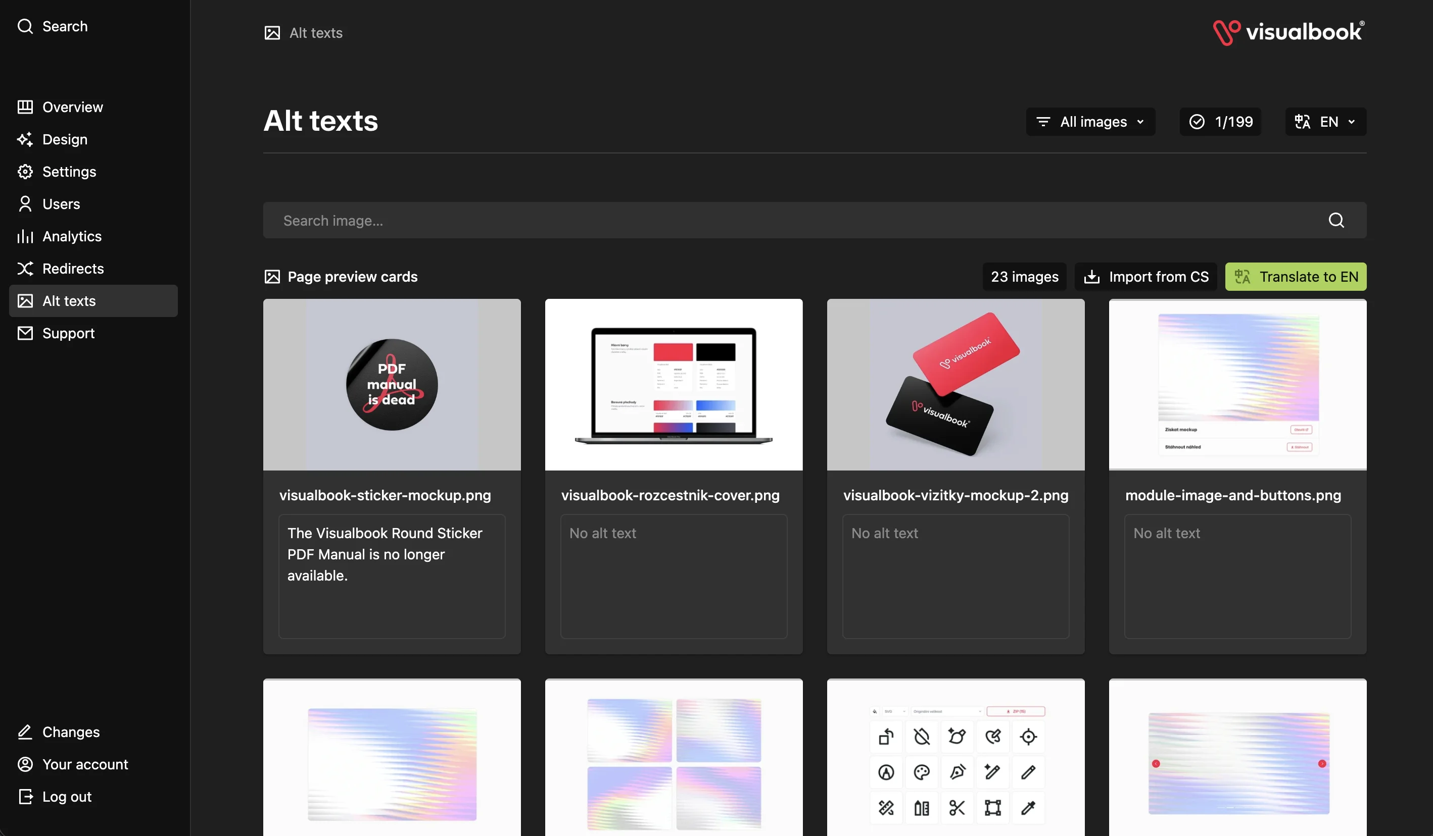
It is faster to do this in bulk via Alt texts in the panel menu:
- you see every image in the manual,
- the No alt text filter shows where a description is missing,
- Translate to other languages carries the descriptions over to the manual’s second language.
A different image for each language
Images and files in a section are set to Linked by default – both languages of the manual use the same file. If the second language needs a different image, such as a poster with English text, switch the field’s sync setting to Unlinked and upload a separate file for each language. Confirm the change with Save.