
Colors
The Colors page shows the brand palette with every value (HEX, RGB, CMYK, Pantone, RAL, NCS and 3M), which visitors can copy or download for design tools and code. You can also add a contrast checker so anyone can verify that color pairs are readable.
What you will have
The Colors page will have swatches with values that copy in one click, a button to export to ASE, CSS, Figma and more, and a contrast checker below the swatches.
Steps
Add a Color swatch section
In the panel, open the page of type Colors. In Sections on this page, click Add new section, enter a name such as “Primary colors”, and choose Color swatch in the Colors category.
Enter the colors
Add each color to List of main swatches. Color name and HEX code are required; RGB is calculated from the HEX. Then fill in the formats the brand uses: CMYK values, Pantone C, Pantone U, RAL code, NCS code, 3M code.
Pick a size and add text
Set Swatch size to Small, Medium or Large. In Description in the left column, explain what the colors are for. Highlight an important exception in the Info box (Note, Tip, Warning).
Add the contrast checker
On the same page, add another section and choose Contrast checker in the Colors category. There’s nothing else to fill in – the checker is built automatically from the colors in the swatches and palettes on this page.
Publish the sections
Save your changes and set the sections to Active. A section in Draft isn’t shown on the page, and the contrast checker doesn’t offer its colors.
How to tell it worked
Open the Colors page in the manual. The swatches have format tabs. Clicking a value copies it (Copied! appears), the download icon offers the exports, and the contrast checker lets you pick colors from this page.
Color formats and how to enter them
| Format | Field | Example |
|---|---|---|
| HEX | HEX code (required) | #E30613 |
| RGB | calculated from HEX | rgb(227, 6, 19) |
| CMYK | CMYK values | 0-89-75-0 |
| Pantone C / U | Pantone C, Pantone U | 485 C, 485 U |
| RAL | RAL code | 3028 |
| NCS | NCS code | S 1085-Y80R |
| 3M | 3M code | 3630-33 |
In the manual, a swatch has a tab for every format that’s filled in for at least one color. Empty formats are hidden.
Which color section to use when
| Section | When to use it |
|---|---|
| Color swatch | The brand’s main colors shown large, with copyable values and exports. |
| Color palette | Several named color sets side by side, such as “Secondary colors” and “Chart colors”. Compact or Wide size, with the same formats and exports as the swatch. |
| Color gradients | A prescribed gradient of two or three colors, with copyable values. |
| Color ratios | The share of each color in materials, in percent. One universal color ratio, or Ratios for light and dark modes. |
| Contrast checker | Checks the readability of color pairs from this page. |
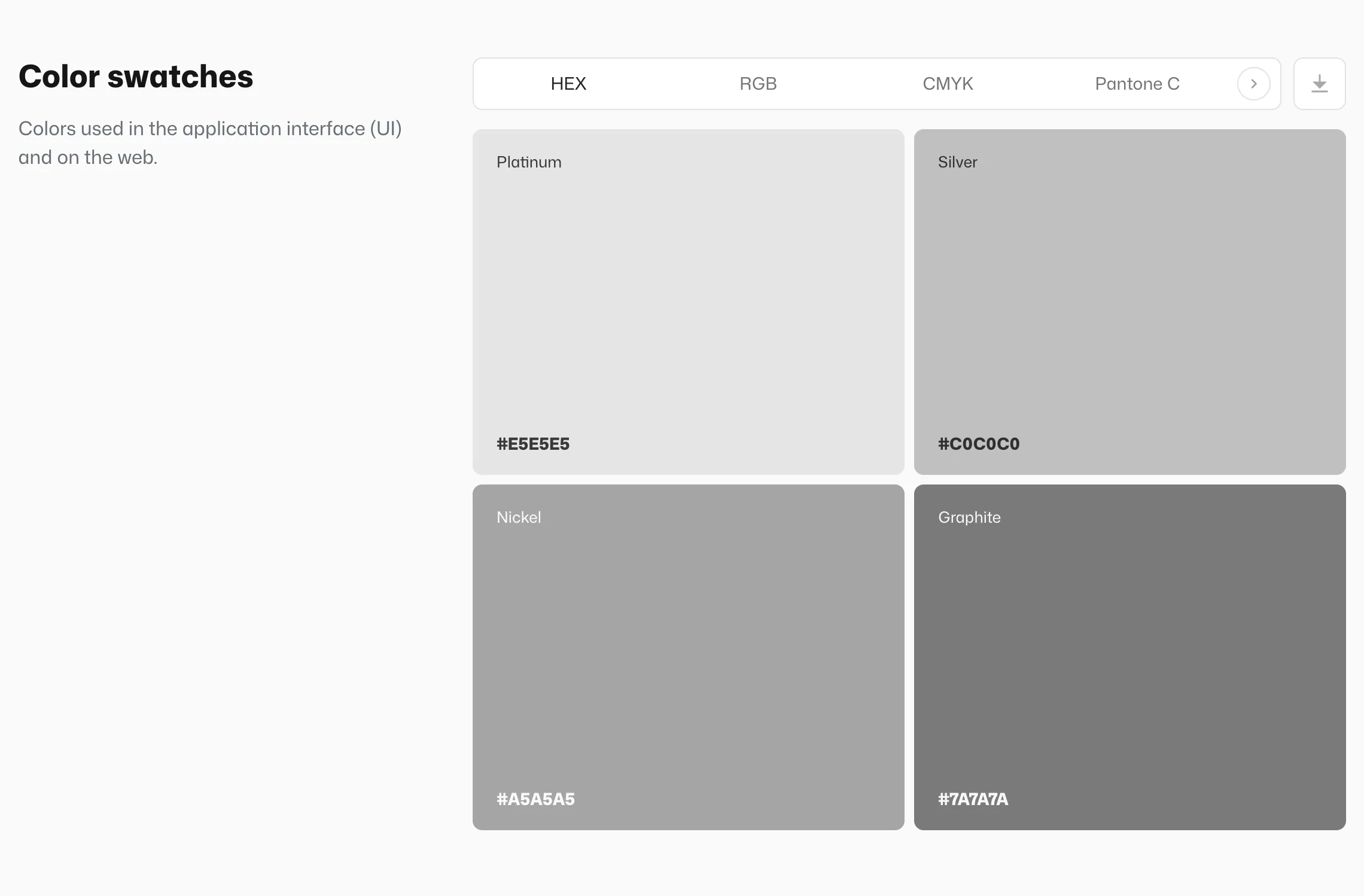
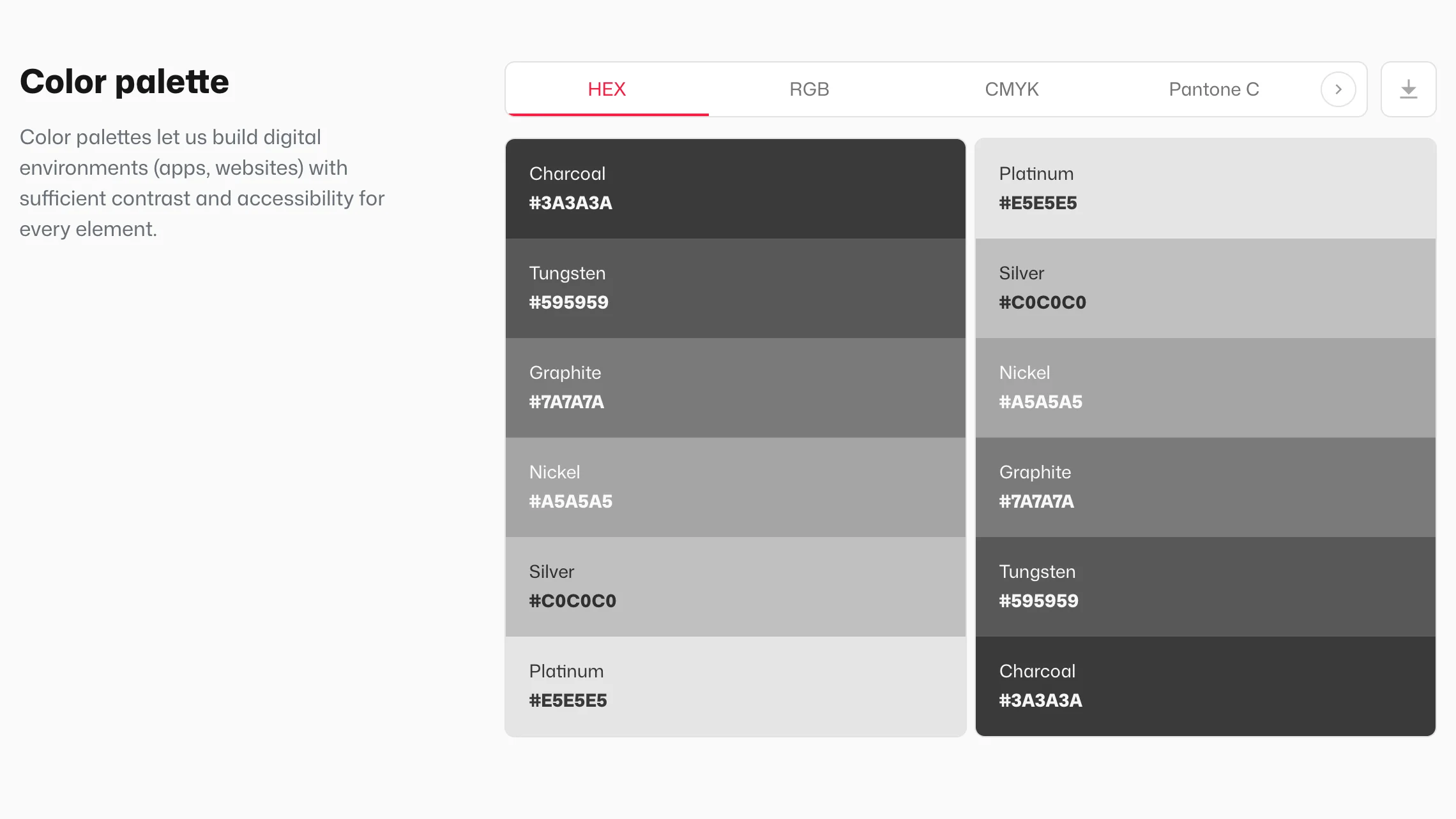
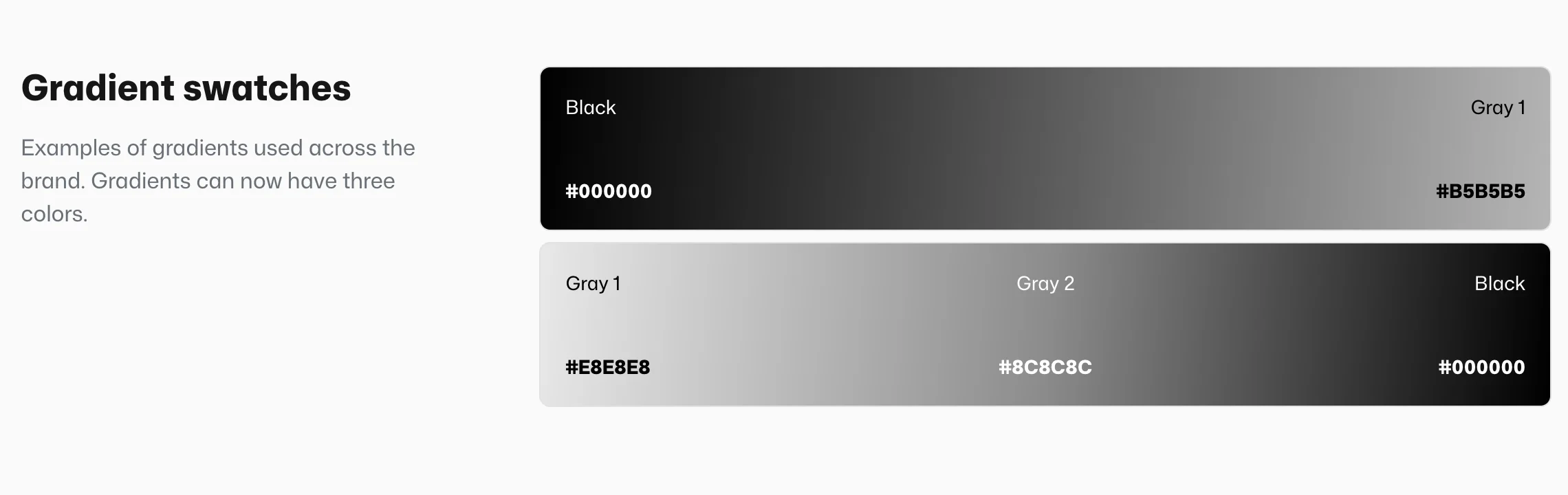
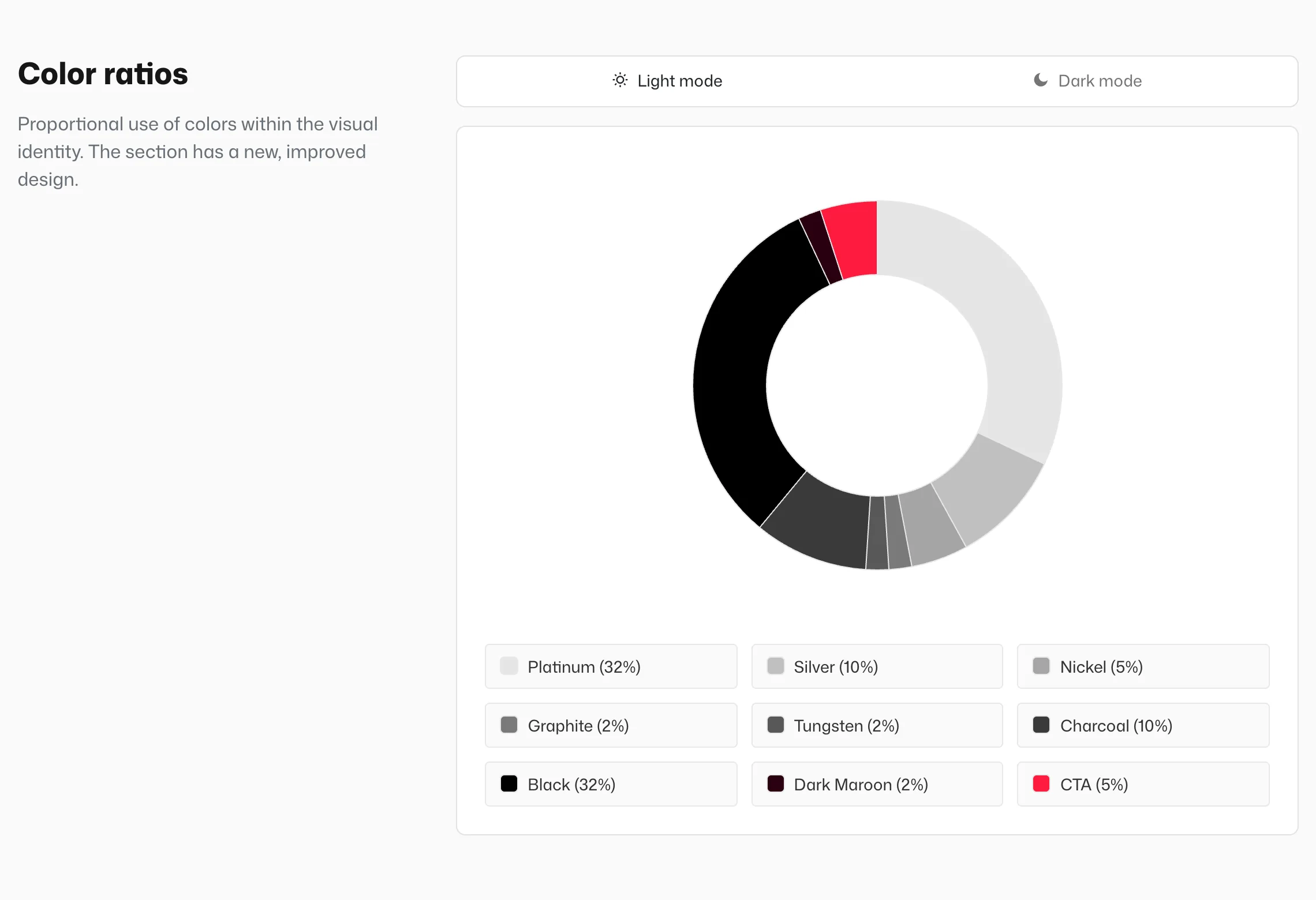
The same grey demo colors in four sections.
Exporting colors
Both the swatch and the palette have a download icon, where visitors can choose:
- RGB and CMYK as
.ase– a color library for Adobe apps (CMYK only when the values are filled in), - Figma - Design Tokens (
.json), CSS Variables (.css), SCSS Variables (.scss), Tailwind Config (.js), - PDF export (
.pdf) with a color overview, - All formats at once as a
.zip.
Contrast checker
Visitors choose a Text color and a Background color by clicking the color square next to each field. Pick from page colors lists the swatch and palette colors grouped by section, Custom color opens a picker for any color, and Reset to default restores the initial state (text in the manual’s heading color on a white background). A HEX code can also be typed straight into the field.
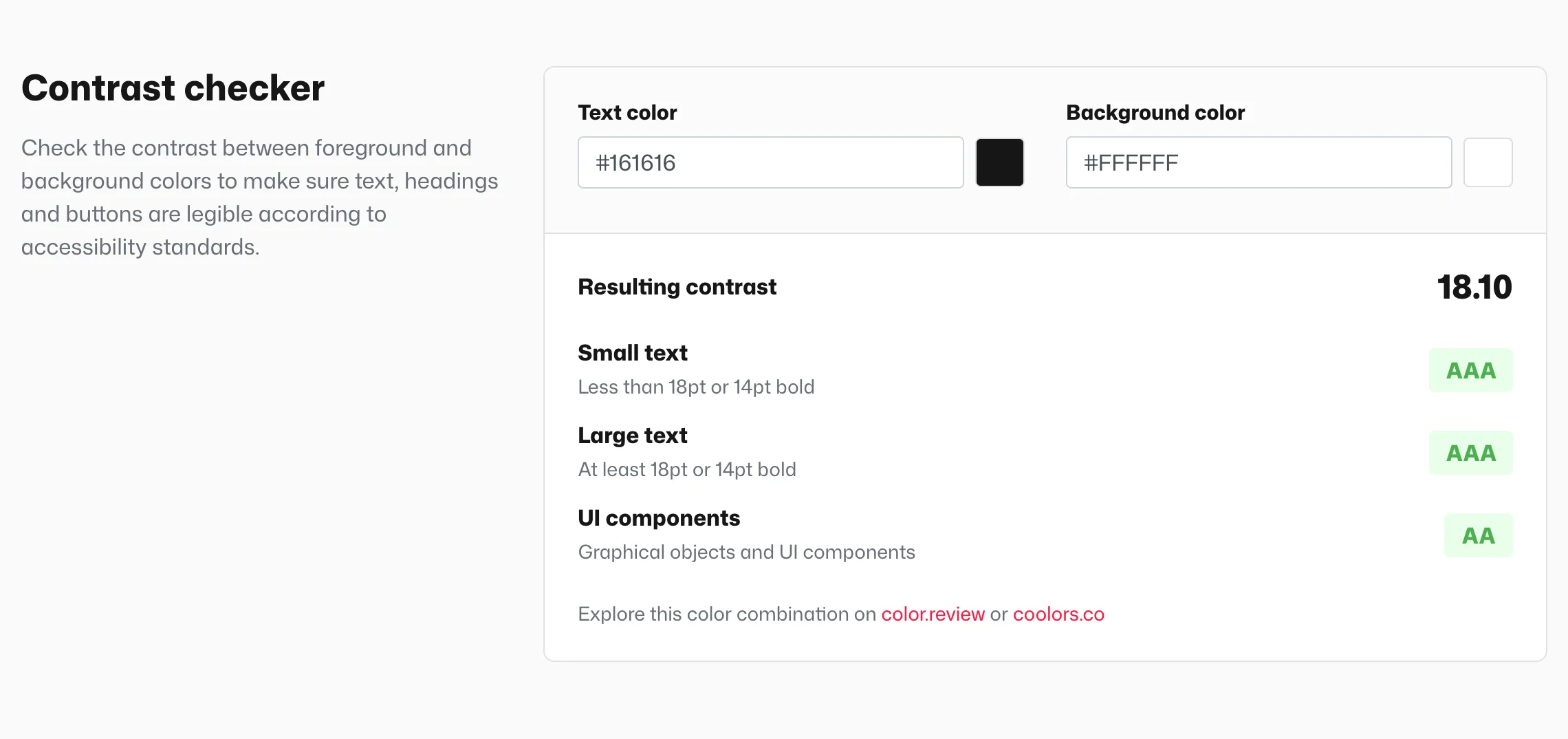
Resulting contrast shows the ratio (for example 4.58), with a rating against the WCAG accessibility standard below it:
| Row | AAA | AA |
|---|---|---|
| Small text – under 18 pt, or under 14 pt bold | 7:1 or more | 4.5:1 or more |
| Large text – at least 18 pt, or 14 pt bold | 4.5:1 or more | 3:1 or more |
| UI components – graphical objects and controls | – | 3:1 or more |
If the contrast falls below the AA threshold, the rating reads “Fail”. Links below the result open the same color pair on color.review or coolors.co.
Brand colors as quick picks
Every color field in the panel (the HEX in a swatch, a logo background, card colors) offers quick picks from Your Brand Colors. They’re set in Design → Colors and aren’t automatically linked to the Colors page: changing a value in a swatch doesn’t change the manual’s design, and vice versa. See Manual design vs. the Colors page.