
Home page cards
The manual’s home page is made of large and small cards. Here is how to add, reorder and remove cards, and where to set their image and description.
Steps
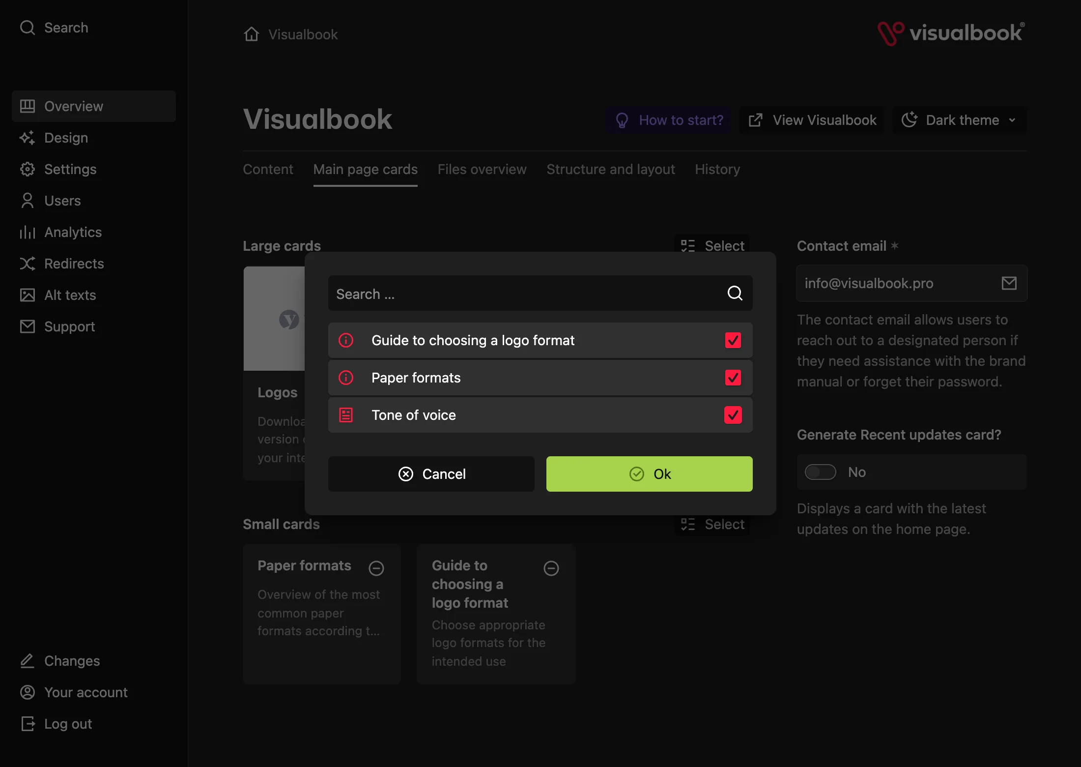
Open the home page cards
In the left menu, click Overview and open the Main page cards tab. It has two parts: Large cards with previews and Small cards.
Add cards
Under Large cards, click Select, tick the pages and confirm. Do the same under Small cards. Each part holds at most 15 cards.
Drag to reorder
Grab a card and drag it to a new position. The order in the panel is the order in the manual and in the sidebar navigation.
Remove a card you don’t need
Click the circle with a dash next to the card title. Only the card goes away – the page stays in the manual.
Save your changes
Click Save. The change reaches the manual only after you save.
How to tell it worked
Open the manual’s home page. The cards are in the order you set and each one leads to the right page.
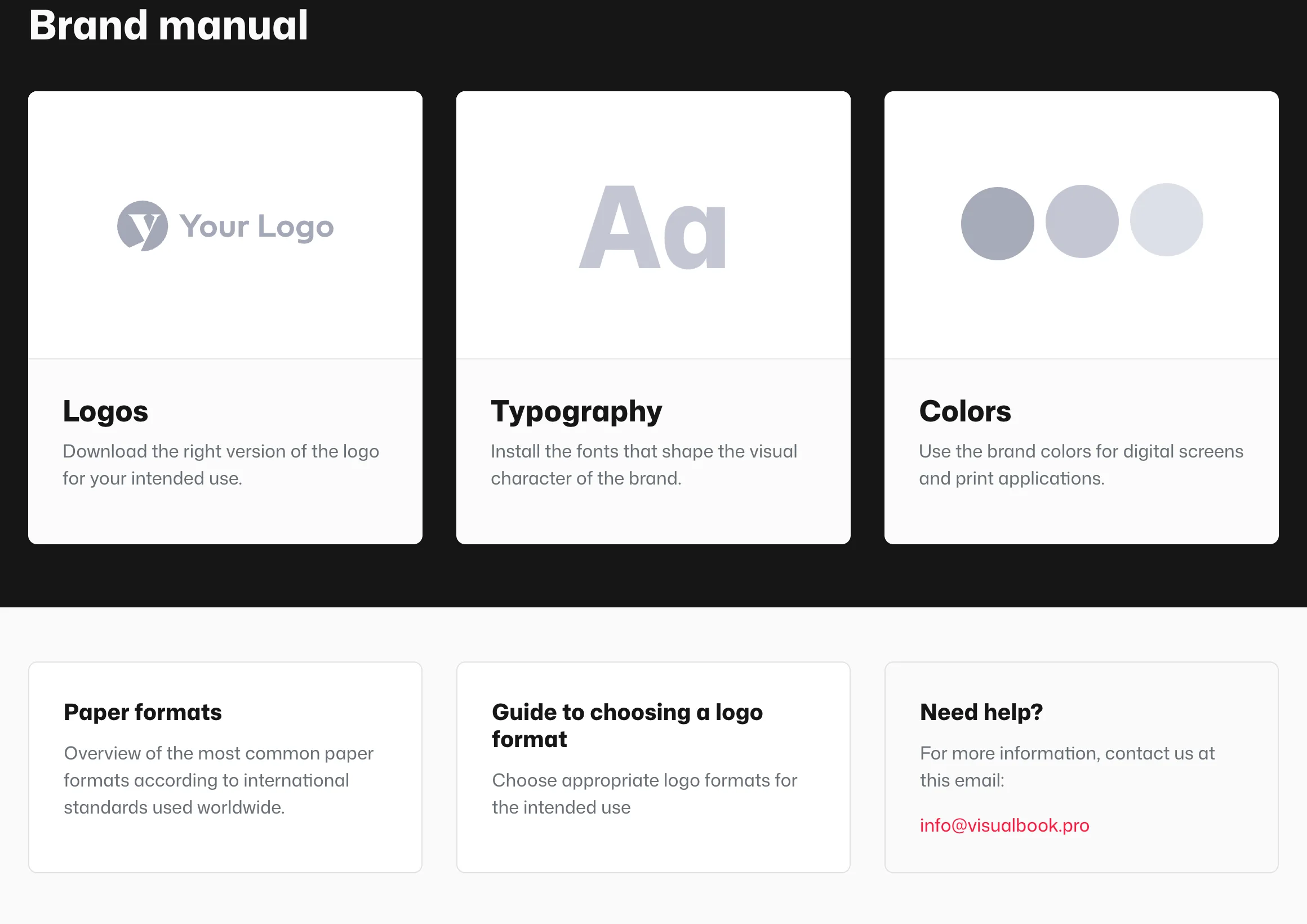
Large or small card?
 12
12- Large cards with an image or a content preview
- Small cards with just a title and description
| Large card | Small card | |
|---|---|---|
| Look | Image or animation, title and description | Title and description, no image |
| Page types | Logos, Typography, Colors, Content page, Page Group, Large gallery, Custom online tool | Content page, Page Group, Large gallery, Custom online tool, Logo format selection guide, Paper formats, External Link |
| When to use | The manual’s main topics | Extras, tools and outbound links |
Set a card’s image and description on the page
Open the page the card leads to. The right column shows This page card preview and below it:
- Card preview image – Image (recommended size 700 × 476 px, JPG, PNG or WebP) or Animation (GIF or Lottie; Lottie is cropped to the card’s ratio).
- Logos, Typography and Colors also offer a generated default preview: Logos, Characters and Swatches. For Colors you also pick a Swatch Style, such as circles or vertical stripes.
- Description of this page’s card – up to 200 characters. Say what visitors will find, for example “Download the logo for print and screen.”
The Recent updates card
On the Main page cards tab, turn on Generate Recent updates card? and under Select 1–3 pages, pick the pages or sections you changed recently.
The Recent updates card style can be Default or Same as info box. The card appears among the small cards.
What if…
- …a page is missing from the Select list? Only top-level pages can go on the home page. Pages inside a group get cards inside that group – see Page groups. Also check whether the page type is allowed for that card size (table above).
- …a card disappeared after you moved the page into a group? That is expected. Give the page a card inside the group.
- …you want different card colors? Set the colors of the large cards’ text area in Design → Colors, see Manual design.